Creating a Drop Down Navigation Menu
Every tutorial I’ve done on navigation bars or menu’s has been the normal one level navigation bar, but when you build a website you may feel the need to create sub categories, for example my blog houses various tutorials which are stored in categories, I have a drop down navigation bar on the main link, which is tutorials which then displays sub catergories and then the specific catergory e.g. Tutorials > XHTML > Basics in that example there are three levels. You can create navigation bar levels using lists, it’s the easiest way to create a drop down menu but for styling it can get a bit tricky, but in this tutorial Im going to show you how to form a drop down navigation menu and then style it with CSS
Forming a basic navigation with lists
First off all were actually going to form the drop down menu itself, forming the drop down menu isn’t that hard it’s styling the lists itself that can get confusing. Were going to start off by creating a basic navigation which is just one level
<ul>
<li><a href="#">Link 1</a></li>
<li><a href="#">Link 2</a></li>
<li><a href="#">Link 3</a></li>
<li><a href="#">Link 4</a></li>
<li><a href="#">Link 5</a></li>
<li><a href="#">Link 6</a></li>
<li><a href="#">Link 7</a></li>
</ul>
This is a basic one level navigation with no styling, but formed by a list (unordered list to be exact) it could be formed with divs but it would get very messy and really it’s all about keeping it simple. Lets introduce a couple of drop down menu’s, look carefully at how the list is formed with the drop downs added in. At first it looks really odd, but hopefull you’ll see why it’s formed the way it is.
Introducing drop down menus
<ul>
 <li><a href="#">Home</a></li>
 <li><a href="#">About</a></li>
 <li><a href="#">Contact</a></li>
 <li><a href="#">Articles</a></li>
 <li><a href="#">Scripts</a>
  <ul>
    <li><a href="#">Drop Down Link 1</a></li>
    <li><a href="#">Drop Down Link 2</a></li>
    <li><a href="#">Drop Down Link 3</a></li>
    <li><a href="#">Drop Down Link 4</a></li>
    <li><a href="#">Drop Down Link 5</a></li>
  </ul>
 </li>
  <li><a href="#">Tutorials</a>
   <ul>
    <li><a href="#">Drop Down Link 1</a></li>
    <li><a href="#">Drop Down Link 2</a></li>
    <li><a href="#">Drop Down Link 3</a></li>
    <li><a href="#">Drop Down Link 4</a></li>
    <li><a href="#">Drop Down Link 5</a></li>
  </ul>
 </li>
  <li><a href="#">Links</a></li>
</ul>
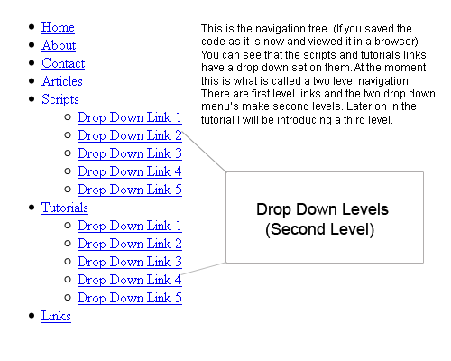
This addition has added a drop down level to the scripts and tutorial links. You have to add a whole new list just before the closing </li> tag of the first level link. It’s important that your lists are closed correctly otherwise you won’t be using valid XHTML and your navigation will just fall apart, quite literally. If you placed this code into a webpage and then viewed it you will have what you call a navigation tree. Which will look like this:
Navigation Tree (Second Level)
Adding a third level
Okay so hopefully you understand the whole navigation tree thing and how the drop down menus work. So far we have a two level navigation, but we are not limited to two levels we can add a third level to a second level drop down taking the second level navigation addition we can add a third level to one or more of the second levels:
<ul>
 <li><a href="#">Home</a></li>
 <li><a href="#">About</a></li>
 <li><a href="#">Contact</a></li>
 <li><a href="#">Articles</a></li>
 <li><a href="#">Scripts</a>
  <ul>
    <li><a href="#">Drop Down Link 1</a></li>
    <li><a href="#">Drop Down Link 2</a></li>
    <li><a href="#">Drop Down Link 3</a></li>
    <li><a href="#">Drop Down Link 4</a></li>
    <li><a href="#">Drop Down Link 5</a></li>
  </ul>
 </li>
  <li><a href="#">Tutorials</a>
   <ul>
    <li><a href="#">Drop Down Link 1</a>
        <ul>
         <li><a href="#">Third Level Link 1</a></li>
         <li><a href="#">Third Level Link 2</a></li>
         <li><a href="#">Third Level Link 3</a></li>
        </ul>
      </li>
    <li><a href="#">Drop Down Link 2</a>
        <ul>
         <li><a href="#">Third Level Link 1</a></li>
         <li><a href="#">Third Level Link 2</a></li>
         <li><a href="#">Third Level Link 3</a></li>
       </ul>
     </li>
    <li><a href="#">Drop Down Link 3</a>
        <ul>
         <li><a href="#">Third Level Link 1</a></li>
         <li><a href="#">Third Level Link 2</a></li>
         <li><a href="#">Third Level Link 3</a></li>
       </ul>
     </li>
    <li><a href="#">Drop Down Link 4</a>
        <ul>
         <li><a href="#">Third Level Link 1</a></li>
         <li><a href="#">Third Level Link 2</a></li>
         <li><a href="#">Third Level Link 3</a></li>
       </ul>
     </li>
    <li><a href="#">Drop Down Link 5</a>
        <ul>
         <li><a href="#">Third Level Link 1</a></li>
         <li><a href="#">Third Level Link 2</a></li>
         <li><a href="#">Third Level Link 3</a></li>
       </ul>
      </li>
  </ul>
 </li>
  <li><a href="#">Links</a></li>
</ul>
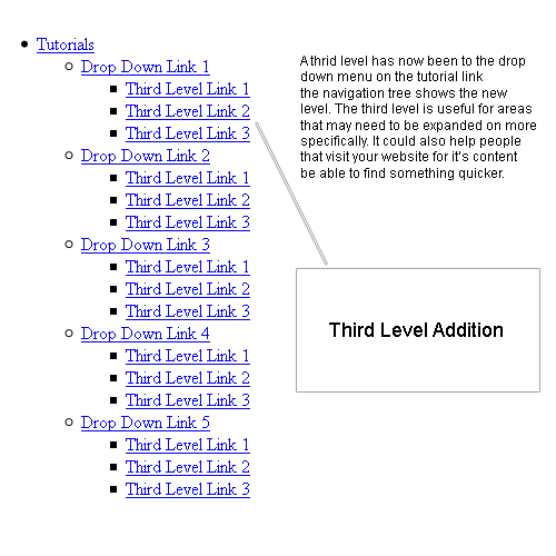
This now makes each link on the second level of the tutorials link have a third level. The navigation tree changes slightly:
Navigation Tree (Third Level)
Okay so I’ve shown you how to form a drop down menu with various levels but now’s time to style the list. This is probably the more harder part to actually do so I’ll break it down in steps.
Adding a class to the list
First of all we need to create one class to style the actual navigation bar before we start messing with any lists. I created the class dropdown and added a div around the list code we’ve been using:
<div class="dropdown">
 <ul>
  <li><a href="#">Home</a></li>
  <li><a href="#">About</a></li>
  <li><a href="#">Contact</a></li>
  <li><a href="#">Articles</a></li>
  <li><a href="#">Scripts</a>
   <ul>
     <li><a href="#">Drop Down Link 1</a></li>
     <li><a href="#">Drop Down Link 2</a></li>
     <li><a href="#">Drop Down Link 3</a></li>
     <li><a href="#">Drop Down Link 4</a></li>
     <li><a href="#">Drop Down Link 5</a></li>
  </ul>
 </li>
  <li><a href="#">Tutorials</a>
   <ul>
    <li><a href="#">Drop Down Link 1</a>
        <ul>
         <li><a href="#">Third Level Link 1</a></li>
         <li><a href="#">Third Level Link 2</a></li>
         <li><a href="#">Third Level Link 3</a></li>
        </ul>
      </li>
    <li><a href="#">Drop Down Link 2</a>
        <ul>
         <li><a href="#">Third Level Link 1</a></li>
         <li><a href="#">Third Level Link 2</a></li>
         <li><a href="#">Third Level Link 3</a></li>
       </ul>
     </li>
    <li><a href="#">Drop Down Link 3</a>
        <ul>
         <li><a href="#">Third Level Link 1</a></li>
         <li><a href="#">Third Level Link 2</a></li>
         <li><a href="#">Third Level Link 3</a></li>
       </ul>
     </li>
    <li><a href="#">Drop Down Link 4</a>
        <ul>
         <li><a href="#">Third Level Link 1</a></li>
         <li><a href="#">Third Level Link 2</a></li>
         <li><a href="#">Third Level Link 3</a></li>
       </ul>
     </li>
    <li><a href="#">Drop Down Link 5</a>
        <ul>
         <li><a href="#">Third Level Link 1</a></li>
         <li><a href="#">Third Level Link 2</a></li>
         <li><a href="#">Third Level Link 3</a></li>
       </ul>
      </li>
  </ul>
 </li>
  <li><a href="#">Links</a></li>
</ul>
</div>
Okay so now we have that class defined we can now begin styling.
Styling the Navigation base
Before anything else we need to style the navigation bar, we don’t need to style anything to do with the list we need actually style the class we added to the list code:
/* Navigation Style */

.dropdown {  font-family: arial, sans-serif; position:relative; width:100%; height:50px; border:1px solid #666666; font-size:14px; color:#ffffff; background:#333333; }
Basic List styling
We now need to style the basic list attributes:
/* Basic List Styling (First/Base Level) */

.dropdown ul {padding:0; margin:0; list-style: none;}

.dropdown ul li {float:left; position:relative;}

.dropdown ul li a { border-right:1px solid #666666; padding:17px 17px 17px 17px; display:block; text-decoration:none; color:#000; text-align:center; color:#fff;}

.dropdown ul li a:hover {color:#ffffff; background:#232323;}
This part is important as it is the foundation for the drop downs to work off.
Styling the Drop Down Menus (Second Level)
Now it’s time to style the second level drop down menus.
/* Second Level Drop Down Menu */

.dropdown ul li ul {display: none;}

.dropdown ul li:hover ul { font-size:13px; display:block; position:absolute; top:51px; min-width:150px; left:0;}

.dropdown ul li:hover ul li a {display:block; background:#000; color:#ffffff; width:110px; }

.dropdown ul li:hover ul li a:hover {background:#666666; color:#ffffff;}
Removing the :hover parts will break the navigation bar, they are there so the drop down menu only appears when the someones mouse hovers over a drop down link, removing it will menu it will constantly display so don’t remove it.
Styling the Drop Down Menus (Third Level)
I said your not limited to just two levels so here’s the styling for the third:
/* Third Level Drop Down Menu */

.dropdown ul li:hover ul li ul {display: none;}

.dropdown ul li:hover ul li:hover ul { display:block; position:absolute; left:145px; top:0; }
Explaining all of that
It would be a waste of time for me to just give you the code and say here look, great drop down navigation bar, it’s no use really if you don’t explain the whole code behind it. Styling the lists is done by signifying which list level you are styling:
.dropdown ul – First Level List
.dropdown ul li – First Level List Item
.dropdown ul li ul – Second Level List
.dropdown ul li ul li – Second Level List Item
.dropdown ul li ul li ul – Third Level List
.dropdown ul li ul li ul li – Third Level List Item
In some cases the third level list item is not needed either because there is no third level, or you don’t need to change anything and want it styled just like the second level drop down. Like I said the styling is the tricky part but hopefully from breaking the various levels down into sections has helped you understand in a more clearer way.
Put it all together
Put everything together and we get this:
<!DOCTYPE html PUBLIC "-//W3C//DTD XHTML 1.0 Transitional//EN" "http://www.w3.org/TR/xhtml1/DTD/xhtml1-transitional.dtd">

<html xmlns="http://www.w3.org/1999/xhtml">

<head>

<title>Drop Down Navigation</title>

<style type="text/css">

/* Navigation Style */


.dropdown { position:relative; font-family: arial, sans-serif; width:100%; height:50px; border:1px solid #666666; font-size:14px; color:#ffffff; background:#333333; }


/* Basic List Styling (First/Base Level) */

.dropdown ul {padding:0; margin:0; list-style: none;}

.dropdown ul li {float:left; position:relative;}

.dropdown ul li a { border-right:1px solid #666666; padding:17px 17px 17px 17px; display:block; text-decoration:none; color:#000; text-align:center; color:#fff;}

.dropdown ul li a:hover {color:#ffffff; background:#232323;}


/* Second Level Drop Down Menu */

.dropdown ul li ul {display: none;}

.dropdown ul li:hover ul { font-size:13px; display:block; position:absolute; top:51px; min-width:150px; left:0;}

.dropdown ul li:hover ul li a {display:block; background:#000; color:#ffffff; width:110px; }

.dropdown ul li:hover ul li a:hover {background:#666666; color:#ffffff;}


/* Third Level Drop Down Menu */

.dropdown ul li:hover ul li ul {display: none;}

.dropdown ul li:hover ul li:hover ul { display:block; position:absolute; left:145px; top:0; }

</style>

</head>

<body>
<div class="dropdown">
<ul>
  <li><a href="#">Home</a></li>
  <li><a href="#">About</a></li>
  <li><a href="#">Contact</a></li>
  <li><a href="#">Articles</a></li>
  <li><a href="#">Scripts</a>
   <ul>
     <li><a href="#">Drop Down Link 1</a></li>
     <li><a href="#">Drop Down Link 2</a></li>
     <li><a href="#">Drop Down Link 3</a></li>
     <li><a href="#">Drop Down Link 4</a></li>
     <li><a href="#">Drop Down Link 5</a></li>
  </ul>
 </li>
  <li><a href="#">Tutorials</a>
   <ul>
    <li><a href="#">Drop Down Link 1</a>
        <ul>
         <li><a href="#">Third Level Link 1</a></li>
         <li><a href="#">Third Level Link 2</a></li>
         <li><a href="#">Third Level Link 3</a></li>
        </ul>
      </li>
    <li><a href="#">Drop Down Link 2</a>
        <ul>
         <li><a href="#">Third Level Link 1</a></li>
         <li><a href="#">Third Level Link 2</a></li>
         <li><a href="#">Third Level Link 3</a></li>
       </ul>
     </li>
    <li><a href="#">Drop Down Link 3</a>
        <ul>
         <li><a href="#">Third Level Link 1</a></li>
         <li><a href="#">Third Level Link 2</a></li>
         <li><a href="#">Third Level Link 3</a></li>
       </ul>
     </li>
    <li><a href="#">Drop Down Link 4</a>
        <ul>
         <li><a href="#">Third Level Link 1</a></li>
         <li><a href="#">Third Level Link 2</a></li>
         <li><a href="#">Third Level Link 3</a></li>
       </ul>
     </li>
    <li><a href="#">Drop Down Link 5</a>
        <ul>
         <li><a href="#">Third Level Link 1</a></li>
         <li><a href="#">Third Level Link 2</a></li>
         <li><a href="#">Third Level Link 3</a></li>
       </ul>
      </li>
  </ul>
 </li>
  <li><a href="#">Links</a></li>
</ul>
</div>
</body>
</html>
Bug Fix:
Thanks to Jamie who emailed me about a certain problem with the navigation bar I have changed the code round a bit to fix a certain bug which when you changed the width nothing would happen to the drop down box sizes, but instead the links would start going onto one line. There was also a problem with when text was different lengths on the same drop down.
Please update your code (If you’ve used this already) and use the following method to change widths:
min-width:150px; (.dropdown ul li:hover ul) – This is the minimum width for the actual drop down links, you shouldn’t change this value to expand the drop down menus anymore.
width:110px; (.dropdown ul li:hover ul li a) – You should now use this width to control the size of the drop down menus. By Default this will make the drop down links align to the center, however you can overide this by using text-aling:left; on the same line the width is set.
Again thanks to Jamie Hudson for submitting this problem to me and advising me on this fix.
Bug Fix 2:
I’ve had a few emails from people that have had problems with the navigation links being everywhere and completly out of line I found that this is because people have been added a width to the .dropdown ul li line this can not be done as it will make every other list out of line, so instead you can simply change the padding setting on the .dropdown ul li a people have been wanting to change the gap between the links so if this is the case you will need to change these padding parts padding:17px 17px 17px 17px; they will need to be changed equally otherwise your navigation base links won’t align.
Bug Fix 3:
Thanks for Steve M, who commeted on the tutorial he provided a fix for IE7 issues where the navigation drop down would keep disappearing to quickly, all you need to do is add a height to the .dropdown ul li:hover ul li a line, this should fix problems with drop downs disappearing too quickly. In IE7
Well thats how to create a drop down menu. It’s basic I know, there are many ways to extend the functionality of this navigation bar e.g. jQuery but thats for another tutorial! I hope this was useful!
Preview the Drop down navigation menu
Note: Someone recently sent me there code and reported it wasn’t working in IE7. This is because they were using the Strict Doctype, in the example I used the Transitional doctype which does work in IE7 and IE8. But the strict doctype does not work for IE7 (And possiblly IE8 too)

 Loading ...