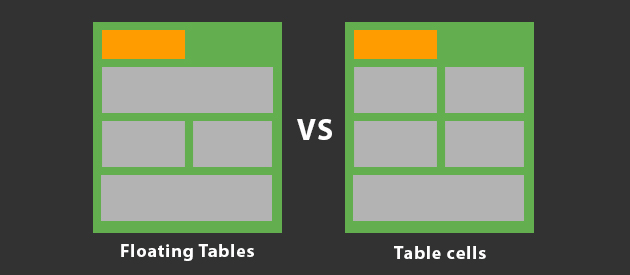
Floated tables vs table cells, what’s the best approach?
When building an email template you will come across two common layout methods, floated tables or using table cells to create columns. Both of these methods are fundamental layout techniques and form the foundation of any email campaign. Both techniques have different strengths and weaknesses, but ultimately what is the best technique to use? Find out in my comparison between the two.
This article is obviously my own opinion, however it aims to compare two layout methods fairly and explain the strengths and also potential weaknesses of both methods. Like many things in the web (and email) world, you can achieve something in various different ways, the same goes for email development. You don’t have to agree with me, just be mindful!
Floating tables
Floated tables involve the use of the align attribute, this essentially can make tables behave as if they had been floated with the float CSS property, but because the float property in CSS has poor support in many email clients, its something not used in a core layout at all. Floating tables with the align attribute however is the nearest solution to achieving the same effect and generally has support across the board, with the exception of a few clients (more on that below).
How does it work?
An example of floating tables would be:
<table border="0" cellpadding="0" cellspacing="0" width="100%">
    <tr>
        <td>
            <table border="0" cellpadding="0" cellspacing="0" width="50%" align="left">
                <tr>
                    <td><!-- Content here --></td>
                </tr>
            </table>
            <table border="0" cellpadding="0" cellspacing="0" width="50%" align="left">
                <tr>
                    <td><!-- Content here --></td>
                </tr>
            </table>
        </td>
    </tr>
</table>
This basic example would create two tables that would be 50% width of the container they appear in, appearing side by side on the same line. Essentially you have created a two column layout, without using table cells.
The advantages:
- More flexible layout control
- Doesn’t require using display:block; to stack content for mobile devices
- Ability to control the stacking order more easily i.e. Reversing techniques
- A better approach for fluid layouts
- Ability to create a mobile friendly layout without using media queries
The disadvantages
- A pain to work with in Outlook
- Alignment and pixel perfect designs are more of a challenge
- Doesn’t work so well with Lotus 6.5 and 7
- Careful width and CSS box model calculations are required
- When using padding, you also have to take this into account for widths/CSS box model
Floated tables in my opinion are better for greater layout control when you want to maybe mess with the stacking order or create a fluid layout. By not using table cells you don’t constrain your layout to be two columns permanently. You can certain code your layout to do that for desktop clients, but then potentially turn it into something different for mobile quite easily. Obviously you can also do this with table cells, but you have to do a lot of table cell stacking when optimising for mobile and also be reliant on media queries which in turns means CSS3 support would also be required from the email client, which sadly not all do (even some mobile clients, looking at you Gmail App)
Disadvantages of this method mainly include this technique being a problem for older clients, mainly Lotus 6.5 and 7 and Outlook. By using floated tables, you lose the general compatibility that table cells often provide for a layout. With floated tables you also have to be very accurate with your width calculations, relative to the CSS box model. Outlook unfortunately lacks a proper CSS box model and hence floating tables in this client can be a massive pain.
There are however some techniques specifically for Outlook that can help you out with this. Lotus 6.5 and 7 remains an issue, but not many email senders are spending the time to support these ancient email clients anyway.
Table cells
A table is expected to have columns which is why we have the <td> to create just that. In comparison to the floated tables example, the same effect could be achieved like this with table cells.
How does it work?
<table border="0" cellpadding="0" cellspacing="0" width="100%">
    <tr>
        <td width="50%"><!-- Content here --></td>
        <td width="50%"><!-- Content here --></td>
    </tr>
</table>
This would create the same two column appearance like the floated tables example, but without having to use the align attribute anywhere. Of course you can use the align attribute on the table cells to place content within the table cells as required, but the layout itself doesn’t need it to create the actual columns.
The advantages
- Generally works well across all clients without any major troubles
- Easily create columns layouts
The disadvantages
- Constrains a layout, not as flexible as floated tables
- Requires display:block; to stack the table cells for mobile devices
- CSS3 support would be required to optimise this type of layout for mobile
- Android 4.4.2 no longer supports display:block; on table cells
- Couldn’t be used in a fluid layout
Generally table cells are more compatible with email clients out of the box so to speak, going down to the real basics, all email clients can parse a table width two or more table cells fairly accurately. This means for multiple columns in a layout, table cells make this a pretty easy and achievable task.
The downsides however, is that by using table cells you constrain your layout. While that might not make much sense on its own. Comparing it to the floated table example, I created the same layout but can further enhance it for other devices more easily, because its not actually constrained to being two columns, where as using table cells that is the case because that’s what the <td> was designed for, and is its only purpose
The other possible downsides to the table cell method is that you’d need to stack table cells to go under each other for smaller screens. In order to do this, you’ll need to use display properties. This would of been fine several months ago, but since the discovery of Android 4.4.2 not supporting display:block; in the native email client, its now questionable as to the validity of this method, because the adoption and usage levels of Android 4.4 will inevitably increase over time. If the lack of display:block support continues, it means the native email client in Android will be less kind to layouts that use table cells to create columns on mobile devices.
My verdict…
From all of my comparisons and experience I would use the floated tables method. I’ll admit I used the table cell method up until a couple of months ago, but after the discovery of Android dropping support for display:block; in 4.4, this was the tipping point of re-evaluating my layout techniques. While floated tables are a pain in Outlook and might not work in Lotus Notes 6.5 and 7, you can use some pretty clever conditional hack to avoid any problems in Outlook and unless you’ve got a massive Lotus Notes 6.5/7 open rate, do you really need to be support these clients any more?
I hope this helps you answer a common question of what layout technique should I use, when it comes to email design. You obviously don’t have to take my answer as gospel, but I aimed to provide the key points for each method and some background on the implementation.

 Loading ...